
VINTAGE ROMANCE - STYLED SHOOT // 14.03.2023
- Blommekind Kuns
- May 30, 2023
- 2 min read
Updated: Jun 1, 2023

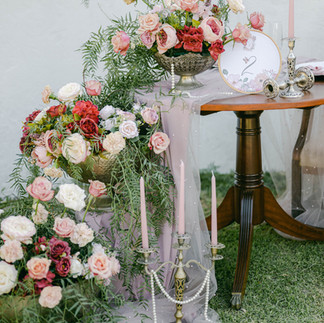
Love is in the air with this cozy & soft romantic palette. Pink, burgundy, white & gold. This is the perfect theme for a garden wedding as it can be complemented by greenery so effortlessly.
STATIONERY FOR THIS SHOOT
by Blommekind Kuns & Ontwerp
For the stationery I designed an elegant logo in the form of a crest with pastel flowers & butterflies. I used the logo throughout the stationery creating a cohesive suite. The Invitation Suite comprises out of a concertina invitation design that folds into a A6 sized card. This design is perfect if you need to present a variety of information as it can display more information than a standard invitation. The card is tied with a soft bow & tucked into a lovely envelope.


For the menu I wanted to play on the softness of the theme by keeping it mainly white with just the logo in colour & tearing the edges of the menu rather than cutting it with a guillotine , not leaving any hard or rigid edges.
For name placements I wanted to try a vintage scroll style - also tearing the edges for that soft look & curling the ends, resulting in a quint little scroll with your guests name.


I love trying unique ideas and therefore I wanted to play on the vintage theme with a embroidery hoop table number & a custom printed fabric insert. I was so excited when I came up with this idea as I couldn't think of a more suitable table number for this theme.


Thank you to the incredibly talented vendors who made magic happen:
Venue, decor & flowers: Rivier Plaas
Photography: Willow Road Photography
Dresses: Esje's Design Potchefstroom
Stationery: Blommekind Kuns
Hair & Make-up: The Ultimate Image
Model: Sule Palko-Moolman


Thank you so much for reading :)
Comments